
New Trend > Emerald named as Pantone’s colour for 2013
PANTONE 17-5641 Emerald
Radiant, jewel-toned Emerald promotes balance and harmony
Pantone LLC, an X-Rite company and the global authority on color and provider of professional color standards for the design industries, today announced PANTONE® 17-5641 Emerald, a lively, radiant, lush green, as the Color of the Year for 2013.
The 2012 Color of the Year, PANTONE 17-1463 Tangerine Tango, a spirited, reddish orange, provided the energy boost we needed to recharge and move forward. Emerald, a vivid, verdant green, enhances our sense of well-being further by inspiring insight, as well as promoting balance and harmony.
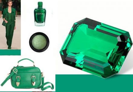
Most often associated with brilliant, precious gemstones, the perception of Emerald is sophisticated and luxurious. Since antiquity, this luminous, magnificent hue has been the color of beauty and new life in many cultures and religions. It’s also the color of growth, renewal and prosperity – no other color conveys regeneration more than green. For centuries, many countries have chosen green to represent healing and unity.
“Green is the most abundant hue in nature – the human eye sees more green than any other color in the spectrum,” said Leatrice Eiseman, executive director of the Pantone Color Institute®. “As it has throughout history, multifaceted Emerald continues to sparkle and fascinate. Symbolically, Emerald brings a sense of clarity, renewal and rejuvenation, which is so important in today’s complex world. This powerful and universally appealing tone translates easily to both fashion and home interiors.”
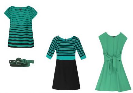
The prevalence of green has been steadily rising for several seasons, especially in the fashion and couture markets, and even on the red carpet. Appropriate for every occasion, Emerald’s classic elegance makes for striking and irresistible women’s formal and everyday wear as well as accessories.
Emerald also makes a strong statement in men’s sportswear, knitwear and ties. Fashion designers featured in the PANTONE Fashion Color Report Spring 2013, including Tracy Reese, Nanette Lepore, Barbara Tfank, NAHM and Marimekko, are incorporating Emerald into their spring collections. Balanced yet sophisticated, Emerald enlivens all colors in the spectrum and will continue to make a statement beyond spring and summer into fall and winter.
Equally harmonious on the cosmetic color wheel, Emerald dramatizes all eye colors as it beautifully enhances green eyes, is compatible to blue eyes, emphasizes the green undertone in hazel eyes and intensifies brown eyes to make them appear deeper. Emerald is also a perfect complement to peaches, pinks, roses, ruby reds and aubergines – offering a variety of lipstick and blush options. For those who want to sparkle and stand out, Emerald is the perfect punctuation point in nail color because of its complementary nature.
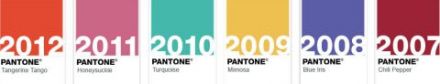
For more than a decade, Pantone’s Color of the Year has influenced product development and purchasing decisions in multiple industries, including fashion, home and industrial design, as well as product packaging and graphic design. Past colors include:
PANTONE 17-1463 Tangerine Tango (2012)
PANTONE 18-2120 Honeysuckle (2011)
PANTONE 15-5519 Turquoise (2010)
PANTONE 14-0848 Mimosa (2009)
PANTONE 18-3943 Blue Iris (2008)
PANTONE 19-1557 Chili Pepper (2007)
PANTONE 13-1106 Sand Dollar (2006)
PANTONE 15-5217 Blue Turquoise (2005)
PANTONE 17-1456 Tigerlily (2004)
PANTONE 14-4811 Aqua Sky (2003)
PANTONE 19-1664 True Red (2002)
PANTONE 17-2031 Fuchsia Rose (2001)
PANTONE 15-4020 Cerulean (2000)


| Spas | Care & Make-up | Health | For Men | Glossaries | Various | |||||
| Intro | Face (care) Make-up Body Hair Endless Youth Mother & Baby Corner Suncare Essentials And more... New products Spot A HairdresserMake-up Artist Directory | Healthy Diet Watching your figure Relaxation | Intro New products | All about... | Phytotherapy All Natural Fashion Perfume Jewelry & accessories And more... What is your style? |
-

 Spas
Spas
-

 Care & Make-up
-

 Health
-

 For Men
-

 Glossaries
-

 Various